Digital Instrument
Premium yet
approachable Taste Experience
This cinematic styleguide defines the tactile, European, and honest digital presence for vomFASS Asia.
Look, Taste, Enjoy.
Typography
Our typographic system bridges the gap between approachable retail and high-end editorial design.
Aa
Enjoyment in Every Drop.
Used for large hero moments, section titles, and dramatic typographic layouts. Bring warmth and substance.
Aa
Honest, straightforward, and highly legible.
Cera Pro anchors the design system. It is used for all long-form reading, UI elements, and supporting text. Its calm geometry balances the expressive curves of Recoleta.
Premium Selection
Used sparingly for overlines, compact labels, and structured data layouts where horizontal space is premium.
Handmade with love.
A warm human touch used exceptionally sparingly for notes, signatures, or highlights. Never used for long text.
Color Palette
A harmonious collection inspired by nature, glass, and tactile materials. The primary palette establishes the premium foundation, while the expanded secondary palette manages specific accents and design elements.
Primary Color
Forest Green Dunkelgrün
Dominates as the primary surface color for a high-quality, premium overall impression.
Primary Color
Slate Schiefergrün
Supporting dark. Subtle depth for surfaces.
Secondary Color
Teal Türkis
Used as the core accent color, providing energy and freshness.
Secondary Color
Light Beige Hell Beige
Soft secondary background, bringing warmth.
Secondary Color
Charcoal Schwarz
High contrast text and bold elements.
Secondary Colors
A vibrant matrix of supplementary tones utilized deliberately for specific graphic overlays, data accents, and premium branding moments.
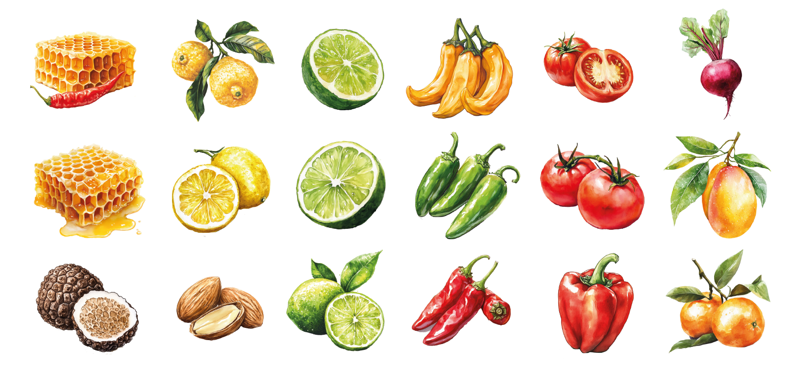
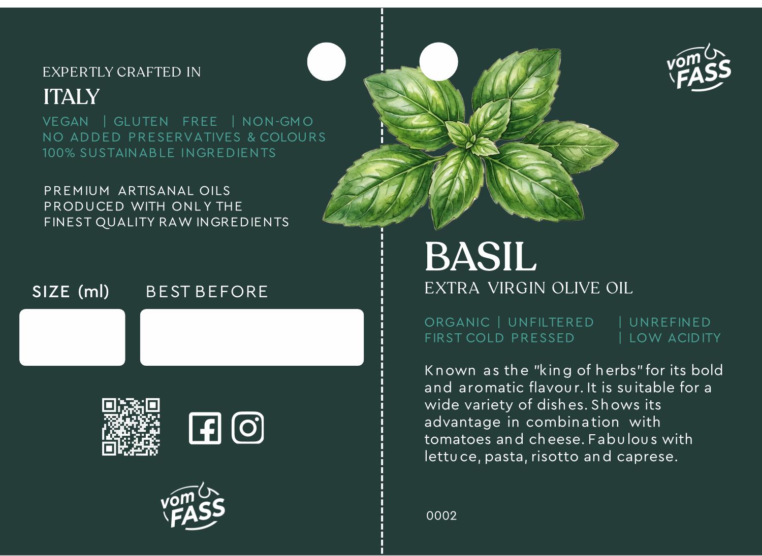
Aroma Identification
Taste Illustrations
Botanical vector illustrations are structurally incorporated into the branding to visually convey specific aroma and tasting notes before the liquid is even sampled, heavily reinforcing the brand's natural authenticity.
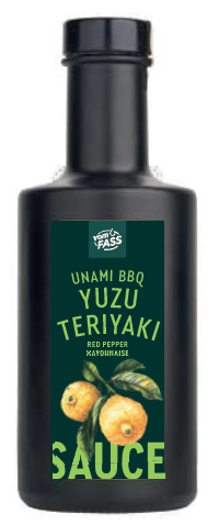
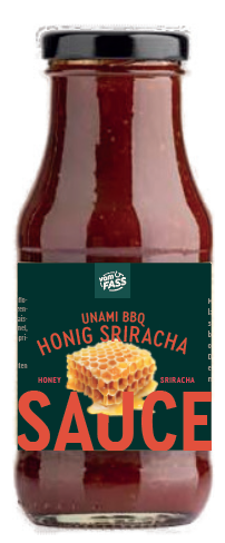
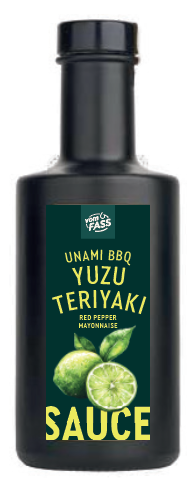
Application Prototypes
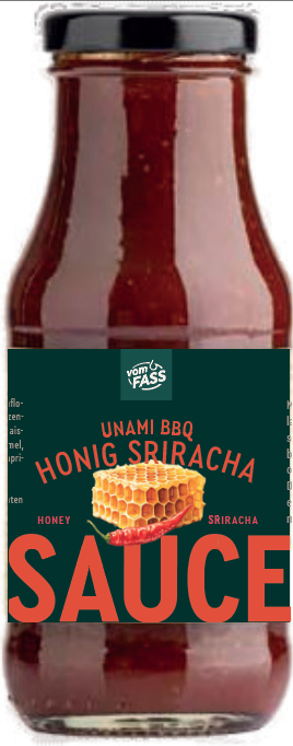
Real-world deployment mappings of the aroma vectors across product labeling. Note the structural alignment and typographic grouping interacting beneath the primary illustration assets.
Retail Execution
Branding Examples
Translating the abstract digital framework into tangible, tactile, and deeply honest retail touchpoints. Heavy natural materials converge with strict typographic precision to express the premium brand identity.
The Hangtag
Precision utility formatting utilizing Cera Pro Regular for functional data delivery, anchored by the iconic Recoleta headline.
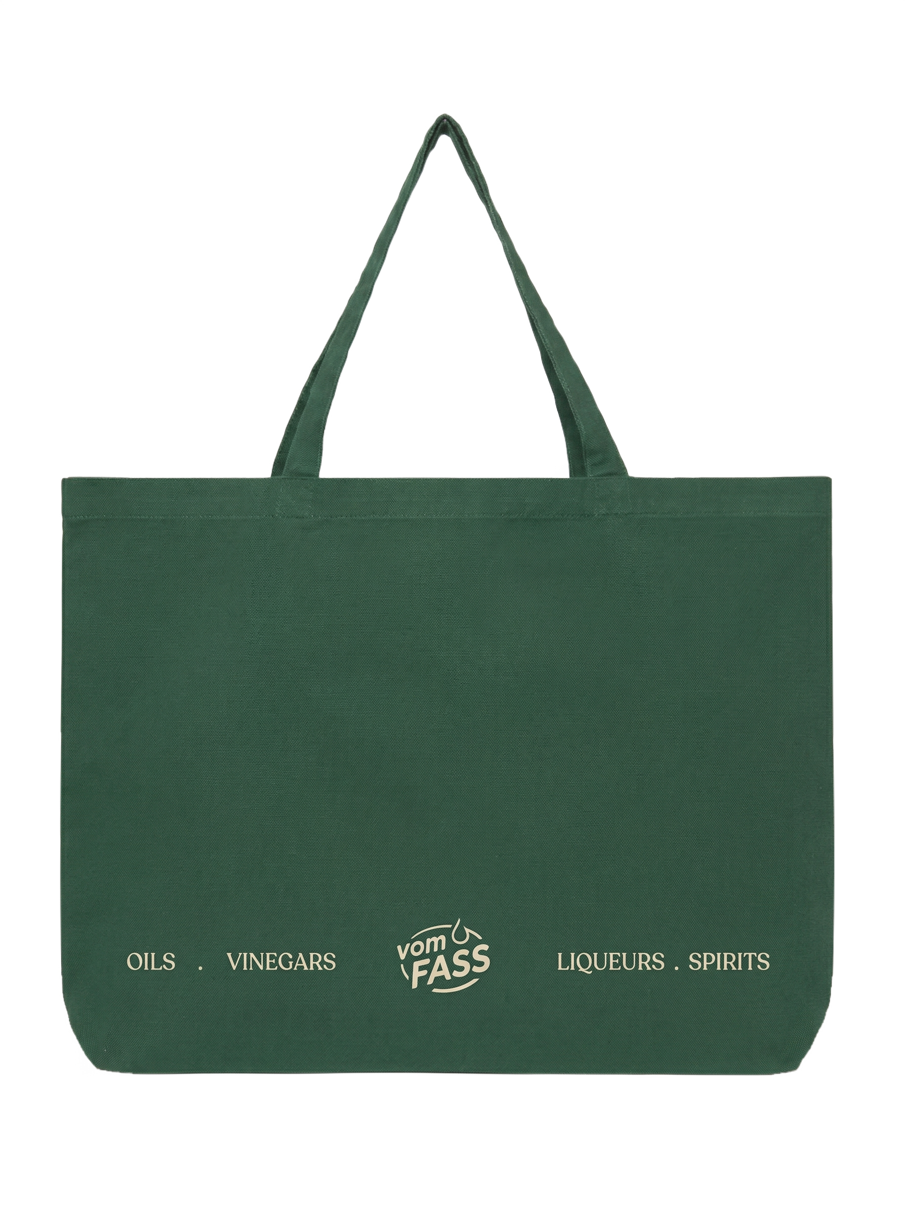
Tote Bag
The deep forest green bag paired with the Light Beige master brand logo offers a timeless, natural contrast. A premium yet naturally understated retail carriage.
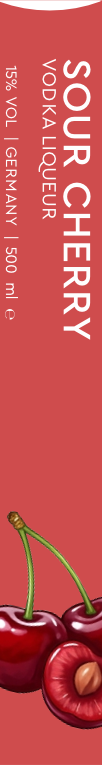
Liqueur Label: Sour Cherry
Headline Cera Pro Medium, body type with Cera Pro regular. Added flavour illustration to convey the taste.

Liqueur Label: Caipirinha Lime
Headline Cera Pro Medium, body type with Cera Pro regular. Added flavour illustration to convey the taste.
Brand Assets
The vomFASS logo is our signature. It requires premium whitespace, restrained framing, and calm presentation.
Primary Positive
Used on light backgrounds (Canvas or very light paper textures). This is the default logo application.
Primary Negative
Used on dark backgrounds (Forest, Slate, or Charcoal). Ensures maximum legibility and contrast.
Logo Clear Space
The logo must always be surrounded by sufficient clear space to ensure its visibility and impact. Let the brand breathe.